
KastoviaHoldings LLC
Identity system · 2026
The existing shield, laurel, black enamel, and gold treatment remain recognizable. The redesign creates a quieter digital system around them.
Logo system
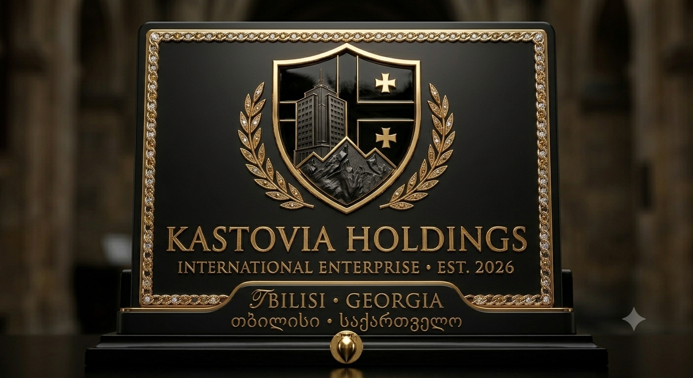
Primary use Compact crest with editorial wordmark on navigation, documents, and product ownership labels.
Ceremonial use Original plaque on company, institutional, and heritage contexts where its detail can breathe.
Never Replace the shield with a generic K, flatten the heritage out of recognition, or place the detailed plaque at tiny sizes.
Color
Gold is an instrument for hierarchy, not decoration. Most of the interface remains charcoal and ivory.
Used for decisive headlines, editorial contrast, and high-value statements.
Used for navigation, body copy, labels, controls, tables, and operational details. Sentence case keeps the tone measured.
Interface language
Thin rules, controlled depth, generous spacing, and proof-led copy.
Explore capability ↗Imagery & motion
Use real product evidence, structured workflow diagrams, precise UI panels, controlled material texture, and subtle depth lighting. Avoid stock-office photography, noisy AI abstraction, generic humanoid robots, and decorative data clouds.
Motion should reveal relationships: a line connects, a state changes, a metric resolves. It should never compete with reading.